
A more human
kind of wireless.
ULTRA MOBILE / IDENTITY EVOLUTION · WIRELESS WITHOUT BORDERS
A modernized logo, a more cohesive visual identity, and a campaign that put people into the picture.
FIVE YEARS OF BRAND EVOLUTION
Still Ultra.
More connected.
Over the last five years, I’ve helped lead Ultra’s visual evolution: refreshing the logo and bringing a stronger, more cohesive point of view to the brand. These excerpts show the earlier direction alongside the system we developed.
A familiar name.
A refreshed signature.
I modernized the logo while keeping the recognition of Ultra’s wordmark. The evolved mark brings a globe into the conversation bubble, with a more open, spaced treatment of “MOBILE.”


A system the team
could build on.
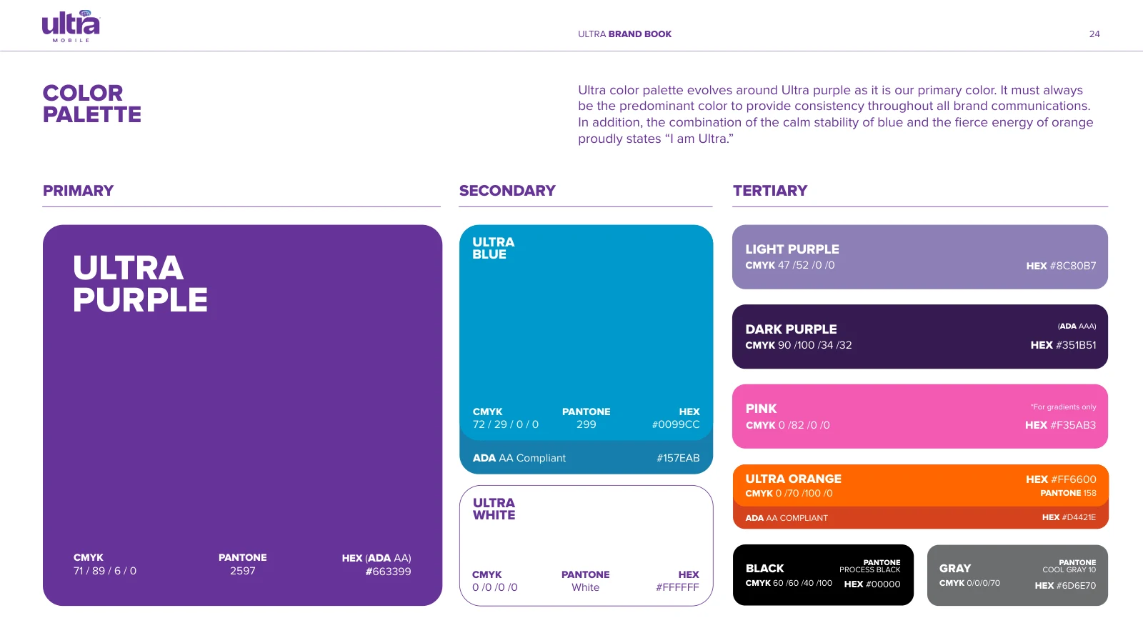
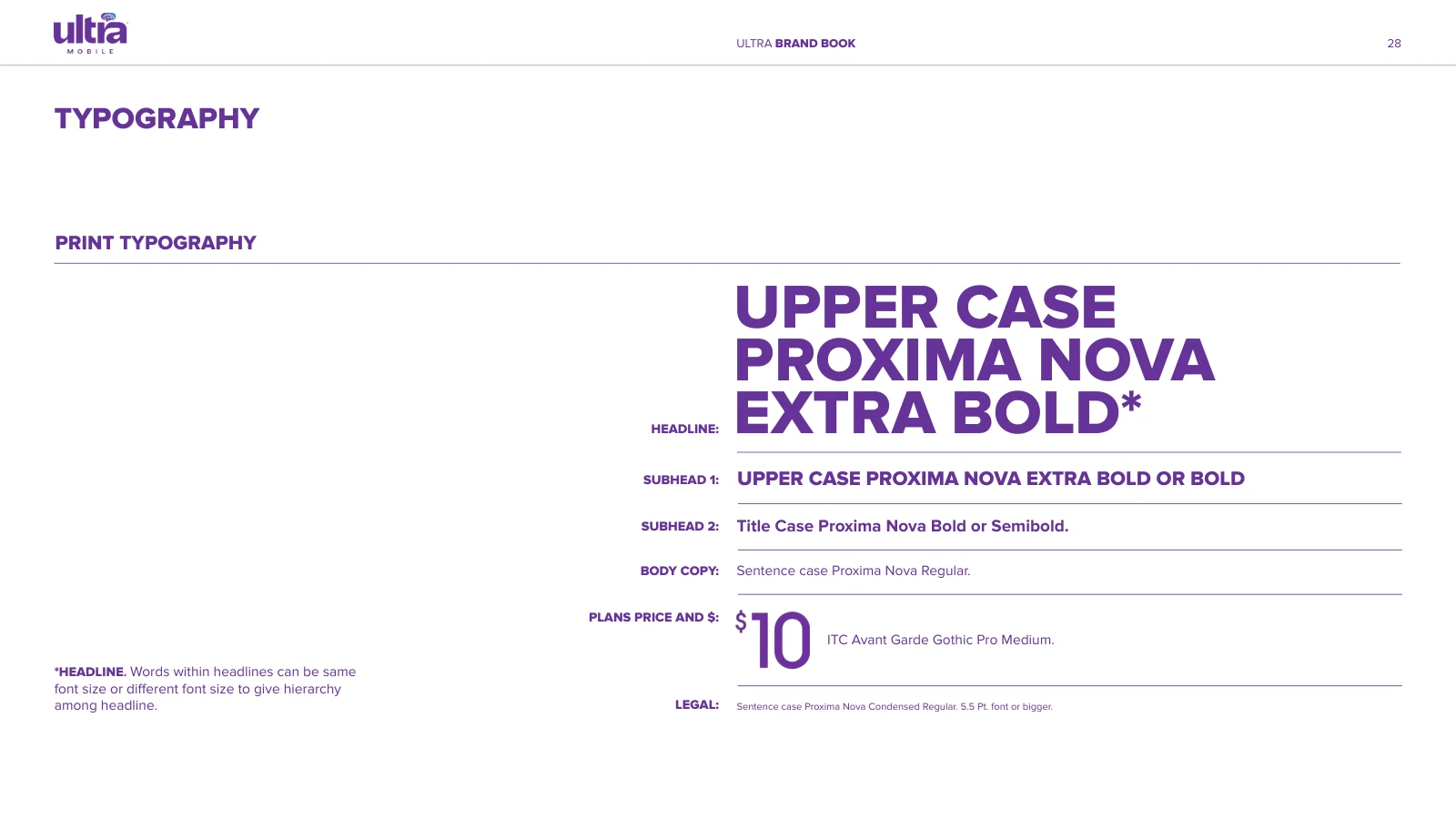
The updated guidelines bring the identity into daily practice: a purple-led palette, clear type hierarchy, and consistent ways to express price, value, and connection.
One brand.
Many points of connection.
From digital communications to retail and multilingual creative, the visual direction needed to feel recognizably Ultra while connecting with the communities we serve.
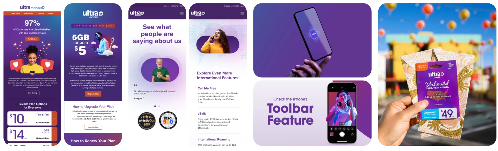
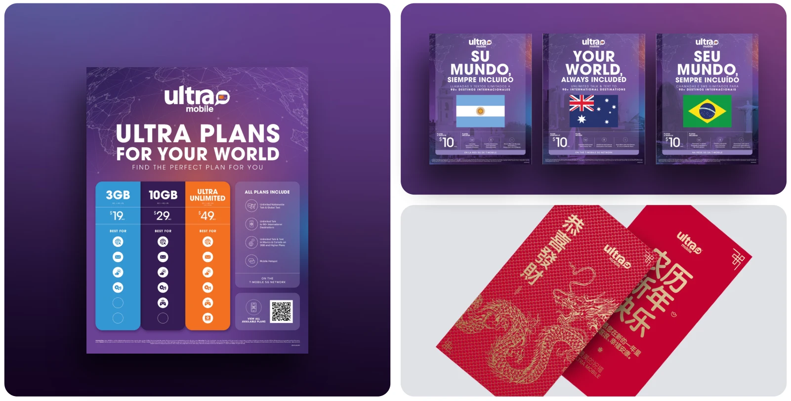
Selected excerpts from the earlier brand strategy revisions and the updated Ultra brand book. Tap any image for a closer look.
CAMPAIGN / GOOGLE & PAID CREATIVE
Wireless
without Borders.
Make the connection feel human. We brought lifestyle photography into Ultra’s Google creative, challenging what we were seeing across the category while keeping the offer clear.
People at the heart
of the offer.
Portraits framed inside a phone bring the idea of connection into the creative. The people, the plan, and the price work together—grounding the promotion in the human side of the brand.
Google creative
WIRELESS WITHOUT BORDERS

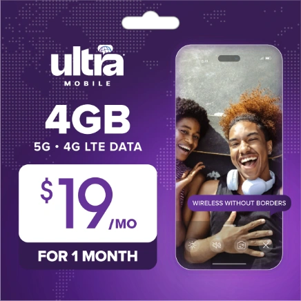
Lifestyle portraits bring warmth and connection to the plan-led creative.
Paid campaign
ONE IDEA, MULTIPLE OFFERS



A consistent visual language across sale, unlimited, and multi-line promotions.
Selected campaign examples. Offers shown reflect the creative at the time of the campaign. Tap any image for a closer look.
My contribution
I helped lead the brand’s visual evolution and the creative shift toward lifestyle imagery. This was a team effort, shaped around a clear decision to make the advertising feel more human.
The response
The campaign delivered a substantial jump in performance. For me, its success reinforced the value of questioning category conventions and bringing the brand’s human side into the work.