
Message first.
Fox with purpose.
MINT MOBILE / VISUAL IDENTITY · BRAND GUIDELINES · CREATIVE LEADERSHIP
I led Mint’s visual identity refresh from start to finish, bringing the message to the foreground and giving our fox a more intentional role.
VISUAL IDENTITY & BRAND GUIDELINES
Same fox.
Sharper focus.
I led the refresh from start to finish: shifting the visual priority to the message, giving the fox an intentional supporting role, and rebuilding the guidelines so the team could carry that direction forward.
Let the offer
do the talking.
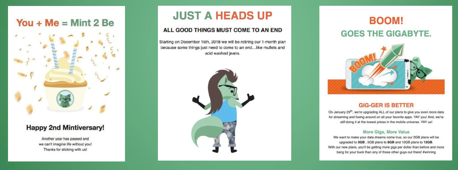
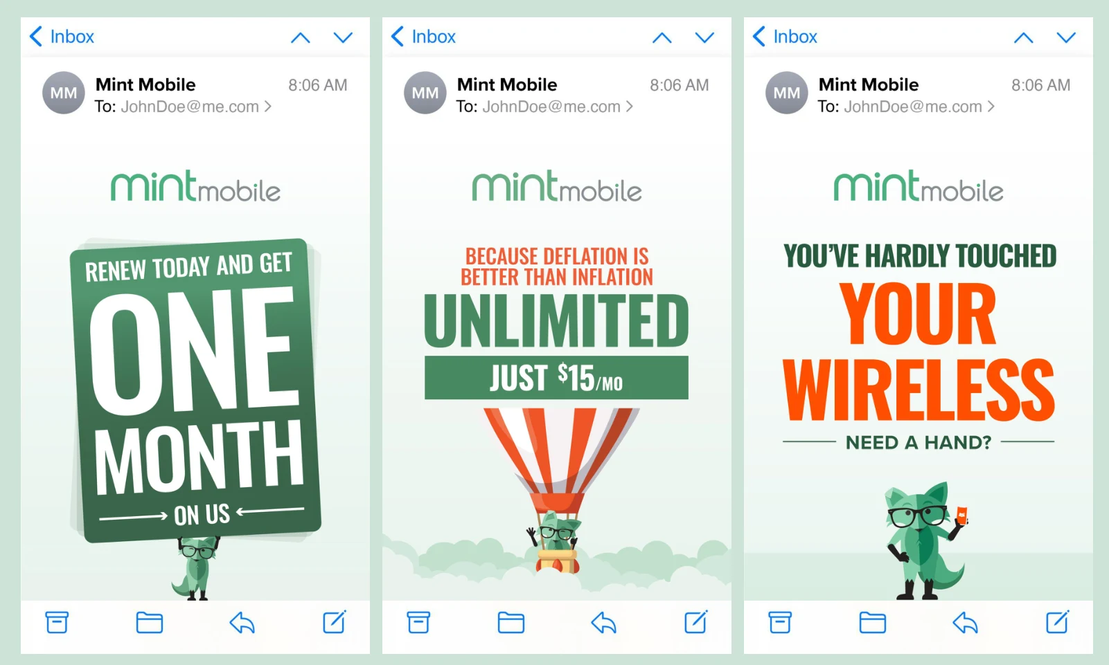
The earlier emails often built a scene around the mascot. The evolved direction puts the message first, using bolder typography and simpler compositions to make the offer easier to find.
Personality,
with a purpose.
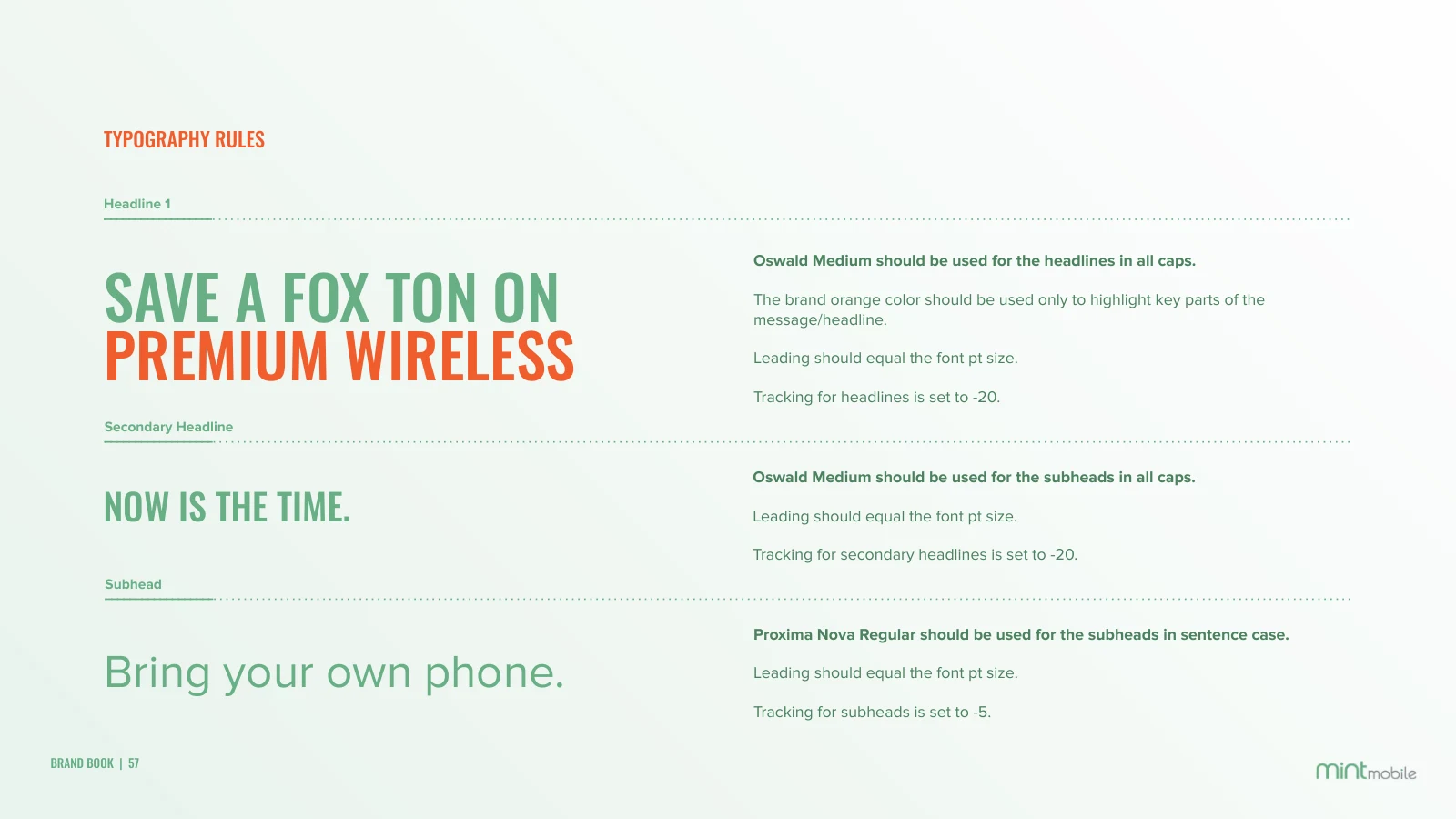
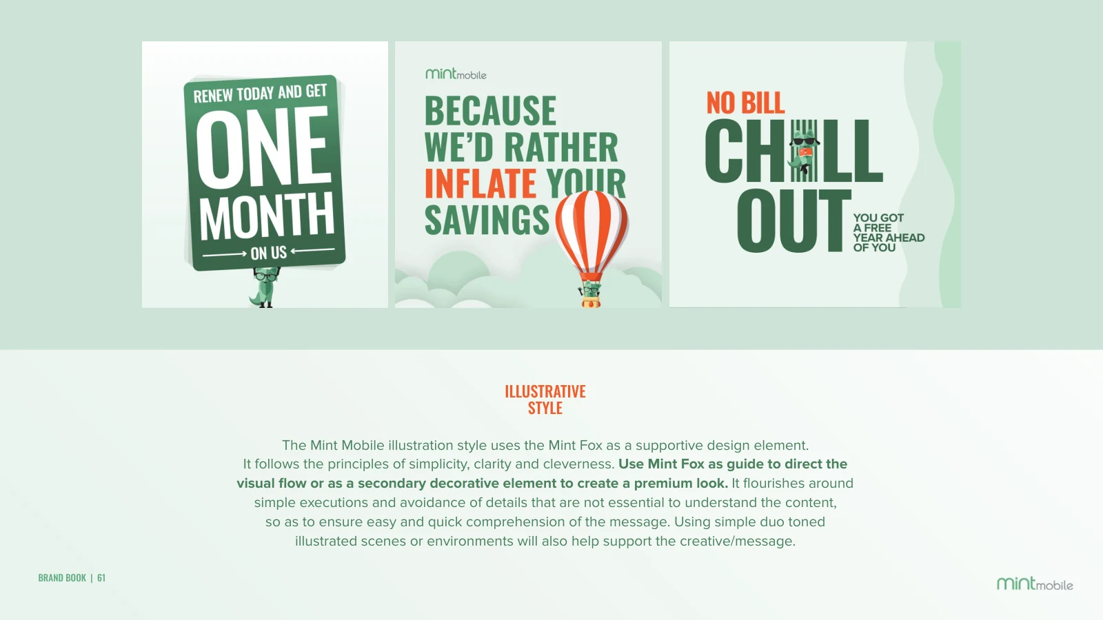
I established rules for typography and illustration that kept Mint’s personality intact. The fox could guide the eye, reinforce an idea, or add a clever detail—always in service of the message.
From a direction
to a daily practice.
I translated the refresh into a complete brand guide, with practical examples the team could use across email, web, print, and paid media. The goal was a consistent point of view with room for good ideas.

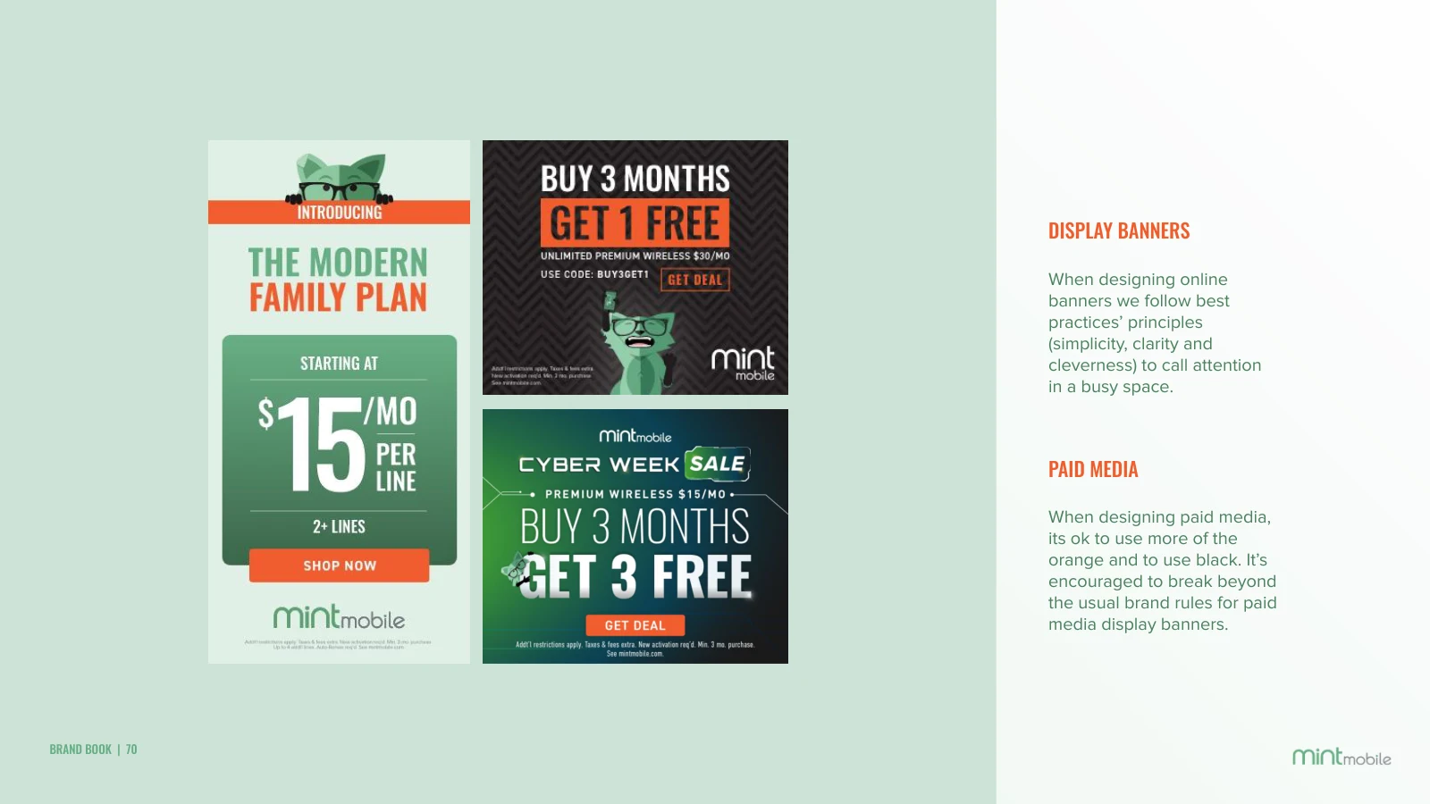
Selected excerpts from the 2021 Mint brand book and the refreshed guidelines. Tap any image for a closer look.
The people behind it
I also built the design team’s foundation: hiring, structure, processes, and culture. That work made the creative direction something a team could carry forward together.
How I built the team ↗